By Camie Roper
For a long time, I used too many colors in my quilts. I just loved color and wanted to use as much as possible. Then I learned about the value of a color scheme.
How did I learn this? I viewed thousands of quilts: from friends, lecturers, online, in books, magazines and at shows. Yes, I needed to choose a color scheme to make my quilts succeed.
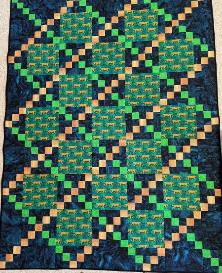
 The Country Lane quilt has a red/green complementary color scheme. I needed a contrasting color for the non-green diagonal squares. I’m not sure why I chose gold. I still have this quilt and use it, but I hide it when company comes. The gold is just jarring with the red and green. It looks almost orange. Today I would probably just go with red.
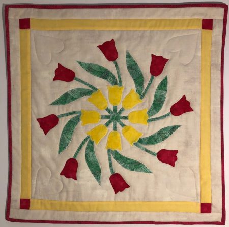 The quilt on the right also uses red and green. (I don’t know what’s wrong with me. Where are all the beautiful blue and purple quilts I could be making?) But the yellow works this time. I used this color scheme from a Mountain Mist® quilt book because the full quilt was absolutely gorgeous. I made one block for a small spring wall hanging and I like the result. In retrospect, though, I should have chosen a different background fabric for more contrast.
 The Country Lane design with blue/green/yellow is more successful. The analogous color scheme (3 colors next to each other on the color wheel) is calmer. Not all quilts want calm, though, do they?
My advice to those beginning to dabble in color is to look at all the quilts and fabric you possibly can. Read about color theory. Buy or print out a color wheel. Buy a set of watercolor paints or colored pencils from the Dollar Store and practice on paper. I use grid paper notebooks to plan out my quilts and try out different color schemes with colored pencils before I even think about buying fabric. This is a very soothing process and will help train your eye in color.
Next time, we’ll take a look at making your fabrics act more like paper. (What?) I also have a few more quilts to show you, some actually in blues and purples.