By Camie Roper
Counterbalance: a weight that balances another weight. Each quilt has a certain substance or weight. Binding helps balance that weight. Keep this in mind when planning your quilt entry.
A quiet binding can calm down a very colorful quilt. Other quilts very clearly incorporate their design into the binding. Yet others add a binding to make a statement.
Prairie points, scallops, or facings can finish an edge – lace, fringe, and even tassels work. A two-toned binding shows one color on front, a different on back – a viable option if front and back contrast greatly. You can change things up by attaching a binding first to the back, then folding it to the front with a pretty machine stitch or invisible slipstitch.
Michigan-educated Marta Amundson’s Quilted Animals – Continuous Line Patterns (Collector Books, 2002) shows binding that spotlights her quilts and makes them shine. (Her B.A. in art and art history comes from Albion College.) You can view a short YouTube video of her work: “Nicolaysen Museum.”
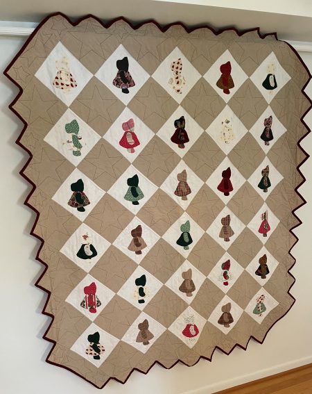
The “Sunbonnet Sue” (a Mountain Mist pattern, 64” x 73”) has bias binding to accommodate the extra stretch needed in the hills and valleys. It definitely gives the quilt its own personality.
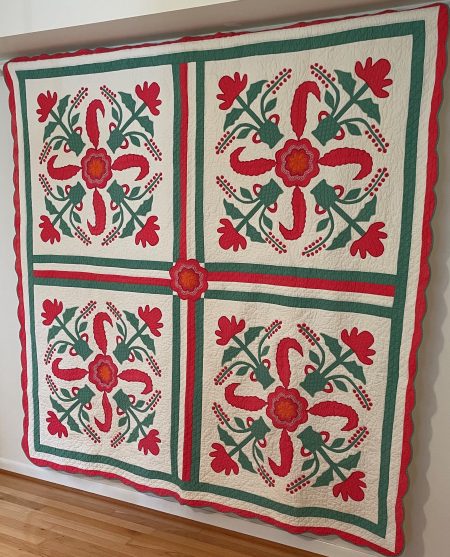
“Princess Feather,” (80.5” square), was passed down to me by family. I think my grandmother made it, as her name and “1942” are embroidered on the back. Green binding contrasts with a red border.
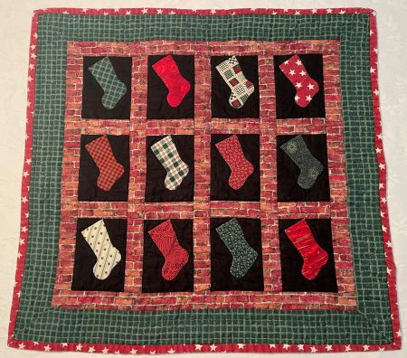 “Hang Your Stocking by The Chimney with Care,” my design. Its name is bigger than the quilt (20” square). I chose starry red to bind the green border, to contrast and provide a little sparkle.
In my next blog, we’ll take a look at creating a label to add dash to your quilt entry.