Blogger: Nico Laudenberg
I figure I’ve always been a color freak, ever since colors have drawn my attention and fascinated me.
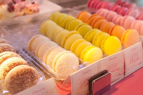
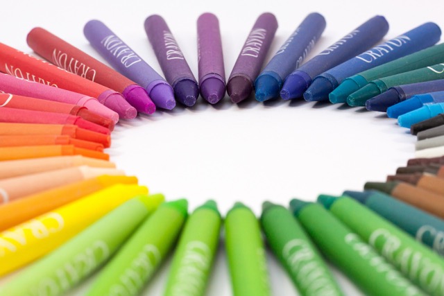
Is there anything better then assorted crayons, a wool shop, or market tables with macaroons in the south of France? Isn’t that a feast? It is.
I read somewhere that colors are like music for the eyes. Exactly!
I remember things mostly by color (“Wasn’t it that red thingy…?“). Asked to search for something, my first question is: “Which color?“
Back in school, I could never understand kids who just dumped their crayons right into their pencil cases, just like this, without any rule, which means – the one and only is my rule: white, yellow, orange, red, pink, purple, blue, green, brown, black!
(You need to know that in Germany kids (now and then) have pencil cases with little rubber bands, that keep their pens and sharpies and whatever in place. That makes it easy to sort them, if you wish to do so.)
The purple sharpie, in between black and green? Eeeew. It’ll be easier to understand if they sharpened their pencils at both ends or if they ate them (alas, in the right order, of course).
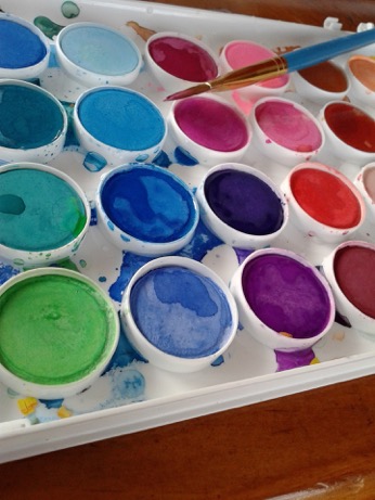
I could have used new crayons, sharpies, poster paints, colors for glass painting, silk painting, paintboxes…. on a daily basis, daily! The saddest thing in my childhood was the fact that you, strictly speaking, actually only need three colors. Only three. My dad kept trying to explain that these three could mix all other colors, that poor sport! I badly wanted the paintbox with 24 colors, at least!
Maybe this is the main reason why I finally ended up quilting: You cannot mix fabric to get a color!
Do you know the saying: “Form Follows Function“? My hubby claims that I only follow this formula: “Form Follows Function Follows Color“. Well, first of all, the color has to be right, then it has to look nice, and if it then functions kinda all right – yah, nice to have, though.
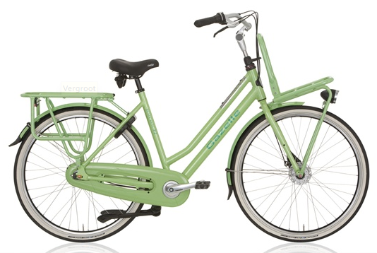
Buying a new bike in the Netherlands, I almost wore out two of my friends while looking for THE NEW NICO-BIKE. After seeing what felt like 83764 or more bike shops, I finally found the right color. And once, I literally bought a completely different car as intended first because the car dealer just didn’t have the other one in a decent color. I went for the smaller, wonderful dark navy blue one and never regretted it.
See, you need to have priorities.
The picture just doesn’t do it justice – in real-life, the color comes out more vibrantly :o)
Ok, I do have a severe color quirk. It is what it is. And it’s fun.
And maybe even a genetic thing. My middle daughter’s life goal is to invent a brand new color. I could have had that idea! I didn’t. Alas…
And so here comes (finally) this topic:
Colors
As being said, we could go with only three measly colors, that’s why they are called primary colors, which are:
Blue, Yellow and Red.
Theoretically, you can mix every other color and shade or tint them through adding the non-colors white and black.
Mixing these three primary colors, you’ll get three more, namely the secondary colors:
Yellow+ Blue = Green
Red + Blue = Violet
Yellow + Red = Orange
Now, counting six. We go on mixing those with the primary colors to get another set of six colors, those are called tertiary colors (for some reason, I can only write this word tertiary down, no way I could pronounce it properly. But I can pronounce ‘photosynthesis’ very nicely since I played bingo with the second graders in my volunteer job. And yes, I know, that’s totally not so important, but I thought I would just mention it)
Ok,
tertiary colors:
- Yellow + Orange = Yellow-Orange or Amber
- Yellow + Green = Yellow-Green or Chartreuse
- Blue + Green = Blue-Green or Teal
- Blue + Violet = Blue-Violet or Purple
- Red + Violet = Red-Violet or Magenta
- Red + Orange = Red-Orange or Vermillion
So, this makes 12 colors, to be precise: THE twelve hues.
As mixing colors with fabrics is not really realistic, here is the solution: BUY FABRICS! As much as you possibly can carry and/or afford. You simply need to! And never let yourself get distracted by (sometimes) male company asking questions like: “Do you still need more red fabric?“, “Don’t ya have some yellow stuff in the cart already? Why more?“ or “Those two teal fabrics here, aren’t they almost alike?“ ALMOST ALIKE is not EXACTLY, right? There are nuances, my dear, nuances…!
By the way: I found this darling little magnet on our road trip to the Smoky Mountains during spring break at Cindy’s wonderful shop The Pattern Hutch (Meet Cindy in person here!) (and this was the best place I could find in Pigeon Forge):
Just saying.
Having set that straight, and having lost non-quilters and/or men to the rest of the internet, we may go on to the most interesting part, my very favorite wheel, the color wheel!
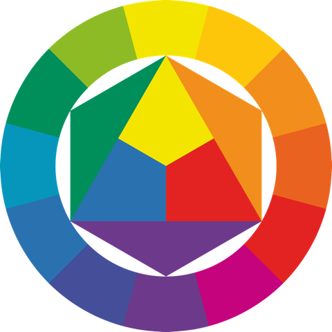
It shows the twelve hues in a reasonable order and reveals some exciting secrets, that can be a big help in life.
A color’s mere location on the color wheel can definitively shed some light when selecting, say fabrics. It will tell you which other color it goes along with, which it’s just on bad terms with, how you can create a calm or a shrill combination and more.
Prior to this I want to clarify some terminology that keeps confusing me.
Hue vs Color
Those 12 primary, secondary and tertiary colors are also called hues. That’s all there is to it.
Value
Value means the relative lightness or darkness of a color. That is, a light green is lighter that a dark green, but maybe darker then a light yellow; that’s why it’s “relative“.
This may have happened to you while sorting your stash. Some instructions ask for sorting fabrics into two piles, a light and a dark one. The first lot goes through easily, but the remainders turn out to be more difficult to decide on and at some point you find yourself left alone with the problem cases. Light or dark? Thanks to technical gadgets- take a picture with your cell phone, use the black-and-white-filter and there you go! It’ll show you way better and ease the decision. You can do this with a copy machine, if handy. Squinting your eyes while looking at the fabric can do the job, also.
Saturation
Instead of saturation you could also say a color’s intensity or degree of dilution. High intensity or saturations means purity while the addition of black, white or grey will make shades, tints (pastels) or work like a filter.
black – shade
grey – tone
white – tint
Flaming red, grass-green, bright yellow – that sounds pretty pure and highly saturated, right? While baby pink, skyblue, reseda green leave a weak impression, rather gentle, boring or kind than powerful and bossy. I know, I’m off the path of technical terminology, but we’ll be back to the the bullet point “colors and emotions“ later, I guess.
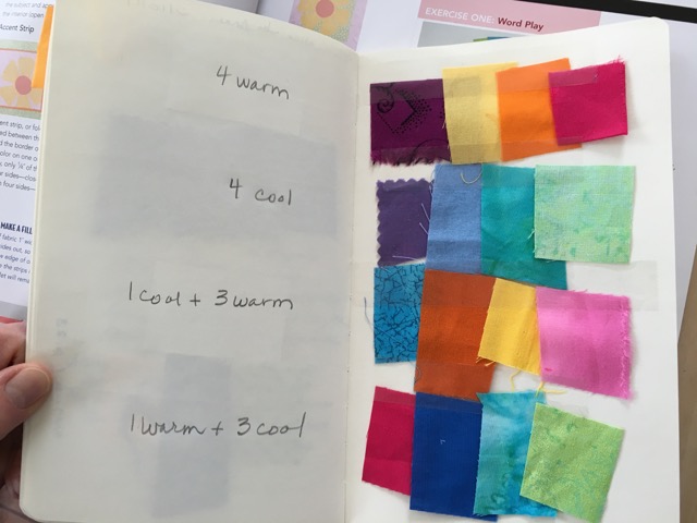
Temperature
You sure have heard about warm and cool colors. I have some trouble getting into this classification. Of course, orange and auburn feel warm to me. But a lot of blues (that should belong to the cool colors) rather give me a warm impression. Googling, I bumped into something enlightening: the perception of temperature is probably ethno-culturally shaped. In medieval times, for example, artists dressed their images or statues of Mother Mary in blue, that was her very color, that should call for a warm feeling, for sure.
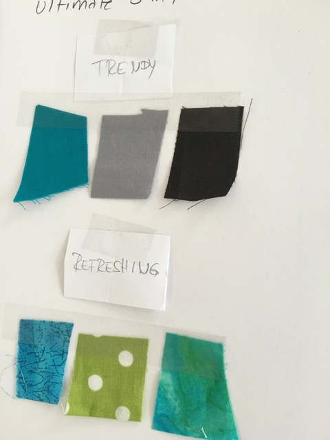
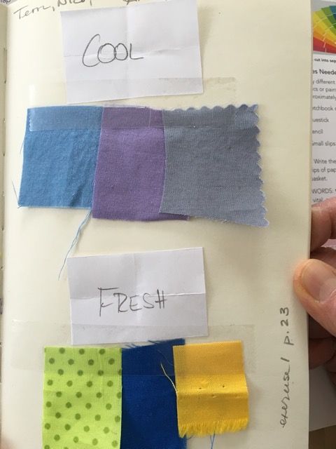
Challenge Group task
Cool Colors
- Blue, Green, Violet
- have soothing, relaxing, reassuring effects
- elegant, precious, fresh
- stand for water, sky, glaciers, objectivity
- give depth as they tend to take themselves aback
Warm Colors
- Red, Yellow, Orange
- vibrant, powerful, energetic
- stand for fire, blood, sun, joy and love
- pop in the front
Neutrals
There is one particular species, that I keep skimming over in fabric shops, knowing I’m doing very wrong: neutrals, like greys, browns, beiges, and of course black and white. These subtle, discrete, elegant fabrics. They don’t talk to me. Not at all. Maybe I just don’t listen, but anyways. But I am aware that I need them more than they need me. Without them, there is no depth in a quilt, they stay clumsy. With them, colors come to life, they gain depth, importance and impact.
Harmony vs Contrast
This is probably one of the first questions you may want to ask yourself when getting ready to plan a new quilt: Should it be a quiet, unobtrusive, smoothing, low-key pal, or are you heading for a drama queen, shrill, loud, fun?
According to this decision, you can choose from a big box of tools:
Play with Color!
Complementary Contrast
As a child I loved it so much, because I was really proud of knowing this complicated word (that’s the same reason why I told everyone that I wanted to become an ornithologist when I was growing up). And it’s still special, because it is so full of energy: the com-ple-men-ta-ry con-trast.
Colors are complementary, when they face each other on the color wheel.
Yellow – Violet
Red – Green,
Blue – Orange
Pure Power, right? Doesn’t necessarily match John Doe’s preferences, yet – a powerful design tool.
A very smart trick keeps up the tension while relieving the eye a bit. That is the
Broken Complementary Contrast
Take – instead of the directly opposing – the two neighbors of that complementary color. This way, you don’t change the strength of the contrast, but give the eye a rest.
Combine:
Yellow with Blue-Violet and Red-Violet
Red with Yellow-Green and Blue-Green
Blue with Yellow-Orange and Red-Orange
And this can even be extended:
Double Complementary Contrast
Combine two complementary couples, that is
Blue and Orange with Green and Red or
Red-Orange and Blue-Green with Yellow-Green and Red-Violet
Also quite vibrant, carefully speaking.
Triadic and Tetradic
To achieve these, choose colors within the same distances on the color wheel, either three, that create a triangle, or
four, that result in a square when linked.
triadic:
Blue, Red and Yellow (our three primary colors)
Orange, Green and Violet
tetradic:
Red-Orange, Violet, Blue-Green and Yellow
Red, Blue-Violet, Green and Yellow-Orange
Triadic combinations can still be very powerful if used with low saturated fabrics, like pastels.
Analogous Harmony
Living in proximity on the color wheel, they show real neighborliness: The use of adjoining colors will yield a calm, friendly and very harmonic quilt. Choose three or more neighbors, and they’ll get on well together:
Green, Blue-Green, Blue and Blue-Violet
Red, Red-Orange, Orange and Yellow-Orange
Yellow, Yellow-Green, Green and Blue-Green
and so on…
Don’t you see an easy-going picture in your mental imagery? Even so, too much of harmony may end up in boredom.
Play with Value and Saturation!
Light-Dark Contrast
This contrast is a pretty logical one, right? Finding its strongest version in black and white, you also create it with light-dark-shades of all colors.
With the targeted use of light or dark fabrics you can either emphasize an area or fade it into the background, for example to “highlight“ a specific shape.
On the other hand, homogeneous light or dark fabric combinations may come across very unified and seamless, as if made from one piece.
Monochrome or Ombré-Harmony
Choose different values and/or saturations of one very hue to achieve a quiet, but not boring quilt. Combining patterned and solid fabrics will add extra interest.
Neutrals
Dreaming of a decent, noble quilt? Just stick with neutrals all over! They work well on their own as well as in combination with strong colors and will always give quietness and coolness. Especially the addition of just one single color as a counterpoint is truly elegant and will even emphasize the reservation of the neutrals.
One more word about patterns vs solids
I am collecting patterned fabrics. Not quite voluntarily. They are so tempting and beautiful, they call for being bought by me. Very, very loudly. Those decent, discrete solids don’t do so (neither the neutrals). Unfortunately! These divine, heavenly whimsical patterns are so wonderful on their own, but trying to combine them can be like hell. I have to be very lucky to combine them just like this. And too much is too much. It’s way easier to combine them with solids or fabrics that read like solids. So, do yourself a favor (if it’s not already a habit of yours) and buy a couple of yards of your favorite color every now and then. Or do like the expert does: It’s the easiest to select your patterned fabrics first and chose the solids accordingly.
Remember, these decent solids can do so much for you:
- create the best and clearest contrasts
- add stability and serenity
- give a bold, graphic look
- tone-on-tone, they make elegant, calm quilts
- highlight your dearly loved patterned fabrics
- highlight the pattern of your quilt
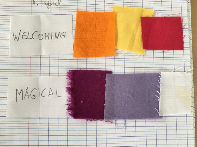
Let’s get emotional
I already mentioned the emotional aspects of color. I really freak out at this point, so I prefer to quote some experts, whether scientists:
- «a phenomenon of light (as red, brown, pink, or gray) or visual perception that enables one to differentiate otherwise identical objects.»
or artists:
- “The deeper the blue becomes, the more strongly it calls man towards the infinite, awakening in him a desire for the pure and, finally, for the supernatural… The brighter it becomes, the more it loses its sound, until it turns into silent stillness and becomes white.“
- “The sound of colors is so definite that it would be hard to find anyone who would express bright yellow with base notes, or dark lake with the treble.” Wassily Kandinsky
- “Color in certain places has the great value of making the outlines and structural planes seem more energetic.“ Antoni Gaudí
- “Color possesses me. I don’t have to pursue it. It will possess me always, I know it. That is the meaning of this happy hour: Color and I are one. I am a painter.” Paul Klee
- “I’m not an abstractionist. I’m not interested in the relationship of color or form or anything else. I’m interested only in expressing basic human emotions: tragedy, ecstasy, doom, and so on.“ Mark Rothko
- “Blue is the male principle, stern and spiritual. Yellow the female principle, gentle, cheerful and sensual. Red is matter, brutal and heavy and always the color which must be fought and vanquished by the other two.” Franz Marc
- “Shadow is a color as light is, but less brilliant; light and shadow are only the relation of two tones.“ Paul Cézanne
And – last but not least – Frida Kahlo, who took these notes in her diary in the early 1940s in an attempt to explain the meaning of colors used in her works:
- Green – good warm light
- Magenta – Aztec. Old Tlapalli, blood of prickly pear, the brightest and oldest color
- Brown – color of mole, leaves becoming earth
- Yellow – madness, sickness, fear. Part of the sun and of joy
- Cobalt Blue – electricity and purity, love
- Black – nothing is black – really nothing
- Leaf Green – leaves, sadness, science, the whole of Germany is this color
- Greenish Yellow – more madness and mystery…all the ghosts wear clothes of this color, or at least their underclothes
- Dark Green – color of bad advertisements and good business
- Navy Blue – distance…also tenderness can be this blue
- Red – blood?….well, who knows?! (see fridakahlofans.com)
Which color would you be, if asked to decide on one?
I sort my stash along the colors, mind you.
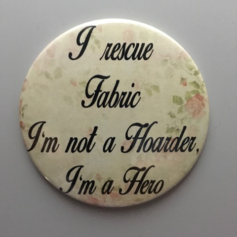
For fat quarters and smaller pieces I misused two Swedish CD-stands and I am very happy with the result. Also larger pieces of fabric are roughly sorted into colors and make me just happy being well visible sitting on their shelves. What a good feeling being a super-fabric-rescue-hero!
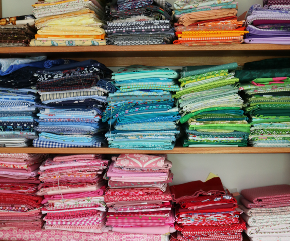
Treasury!
I could write on endlessly. About favorite colors, for example. Or psychology of colors, the color theory by Max Lüscher. But doing so, I don’t have the time to pet and sew my little colorful friends. So I randomly stop here.
First published April, 2017
Thank you for sharing. I love this for sure.